With Bar Chart Maker, you can easily create intuitive bar charts. A Bar Chart compares differences between categories using the length or width of rectangular bars. It is one of the most widely used types of data visualization. With Bar Chart Maker, you can quickly generate bar charts — no coding experience required. Simply prepare your data, enter it into our visual tool, or click the corresponding buttons to produce a professional chart in seconds. Charts created with Bar Chart Maker are widely used across various industries, from sales data analysis and population studies to survey results. Whatever your needs, Bar Chart Maker makes it simple and efficient.
Press the Enter key to confirm.Double click to edit item.
Nulla facilisi. Phasellus sollicitudin nulla et quam mattis feugiat. Aliquam eget maximus est, id dignissim quam.
Donec placerat, lectus sed mattis semper, neque lectus feugiat lectus, varius pulvinar diam eros in elit. Pellentesque convallis laoreet laoreet.
Nunc vitae orci ultricies, auctor nunc in, volutpat nisl. Integer sit amet egestas eros, vitae egestas augue. Duis vel est augue.
Nunc vitae orci ultricies, auctor nunc in, volutpat nisl. Integer sit amet egestas eros, vitae egestas augue. Duis vel est augue.
The bar chart is one of the most common and fundamental types of data visualization. It represents the magnitude of categorical data through the height or length of rectangular bars. Do you know who invented the column chart? What did the world's first bar chart look like?

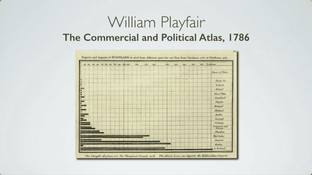
The world's first bar chart can be traced back to 1786, invented by Scottish political economist and engineer William Playfair (1759-1823). As early as the 14th century, concepts similar to such charts appeared in the works of French mathematician Nicole Oresme, but they did not become widespread at the time. Later, Playfair first used the bar chart in his 'Commercial and Political Atlas,' where he plotted a year's worth of trade data as a series of 34 bars—one for each of 17 trading partners—to compare import volumes across different regions of Scotland. At this point, he realized that comparing quantities through visual elements was more intuitive and effective than simply looking at tabular data, and it was also more memorable. Therefore, Playfair is widely recognized as a pioneer of statistical graphics, and the bar chart is one of his important contributions to the field of data visualization.
| Element | Description | Key Function |
|---|---|---|
| Title | A description of the entire chart, usually a brief summary of the chart's content. | Tells readers the topic and purpose of the chart. |
| X-axis (Horizontal Axis) | Typically represents categorical variables or discrete time points. | Shows the categories or groups being compared. |
| Y-axis (Vertical Axis) | Typically represents numerical variables or continuous quantities. | Shows the data size (height/length) for each category. |
| Bars | The height (vertical bars) or length (horizontal bars) of rectangles is proportional to the values. | The core element that directly represents data size. |
| Legend | Used when the chart contains multiple data series (such as stacked or grouped bar charts). | Distinguishes data series represented by different colors or textures. |
| Tick Marks and Labels | Markings and values along the axes, used to read data accurately. | Helps readers accurately determine the values represented by the bars. |
| Type | Description | Use Cases |
|---|---|---|
| Column Chart | Vertical bars with categories on X-axis and values on Y-axis. | Most common, suitable for short category names. |
| Bar Chart | Horizontal bars with categories on Y-axis and values on X-axis. | Suitable for long category names or displaying rankings (ascending or descending). |
| Grouped Bar Chart | Multiple bars side-by-side within each category representing different sub-series. | Compare differences between groups within the same category and overall differences between groups. |
| Stacked Bar Chart | Bars divided into segments, each representing a sub-series. | Show composition of each total (bar height) and compare totals. |
| 100% Stacked Bar Chart | All bars fixed at 100% height, showing only proportional composition. | Emphasize proportional differences across categories while ignoring total value comparisons. |
Bar Chart Maker supports customizing both the background color and foreground color for each series(bar) individually. You just need to find the series you want to modify in “Series Config”, then click “BG-Color” to change the background color and “FG-Color” to change the foreground color.
Making a horizontal bar chart in Bar Chart Maker is very simple. You just need to locate the "Category Axis" setting and then set the Category Axis to the Y-axis, and all the series will be displayed horizontally.
Bar Chart Maker supports freely switching the chart type for each series. If you want a specific series to be displayed as a line chart, simply go to the "Series Config," find the series you want to modify, and set the "type" to "Line."
Creating a stacked bar chart is really easy. Just go to "Series Config", find the "Stack Flag" input field, and set the same identifier value for the categories you want to stack together.
In "Series Config", the bar chart generator provides a "Data" text area. Simply enter your data there, separating multiple values with the Enter key. The data you input will be displayed immediately in the preview area.