Chart Generator is a free online chart-making tool. Some users also refer to us as Chart Maker, but essentially, it’s the same tool. Our goal is to help users quickly create professional and intuitive data visualizations. No coding skills are required—simply configure your settings to generate a wide range of chart types, including bar charts,line charts, pie charts, radar charts, and dashboards. Whether for data analysis, report presentations, or educational purposes, Chart Generator makes it easy to bring your data to life. You can download charts in high-resolution images or seamlessly embed them into your website using iframe code.
There are many ways to create charts, with the most common being Excel charts, Photoshop-designed graphics, and front-end libraries like ECharts.js. Each method requires users to have certain technical knowledge, and they all have their own drawbacks—plus, they're not necessarily suitable for everyone. Below, we'll compare these methods and help you find the one that works best for you.

There are many front-end visualization libraries available today that can create excellent charts, but for ordinary users, they may have no coding experience. While these libraries are powerful and highly interactive, the learning curve varies depending on your experience level. What all these libraries have in common is that you need to be familiar with a large number of configuration options to create beautiful and functional charts. If you have zero coding experience, you'll likely need to spend a significant amount of time getting familiar with the code and configurations. This can be a real barrier for non-technical users.
As we all know, Excel offers chart-making features that are convenient for most people, but the drawbacks are pretty obvious. Excel has many structural limitations when it comes to professional data visualization, data analysis, and web display. Charts created in Excel are static with limited interactivity. Users can't dynamically control what data is shown or hidden, and Excel charts don't allow fine-tuned control over label display or position adjustments. Additionally, Excel charts can't show detailed data on mouse hover and other interactive features. Excel's chart customization capabilities are fairly weak. Its color schemes and templates are limited, and it has poor support for gradients, transparent colors, borders, shadows, and image backgrounds. Excel charts can't be shared online or embedded into web pages. If you want to share one, you have to send the entire Excel file. For web display needs, it simply can't deliver. If you want to embed your chart into your own website as a web element, Excel won't let you do that.
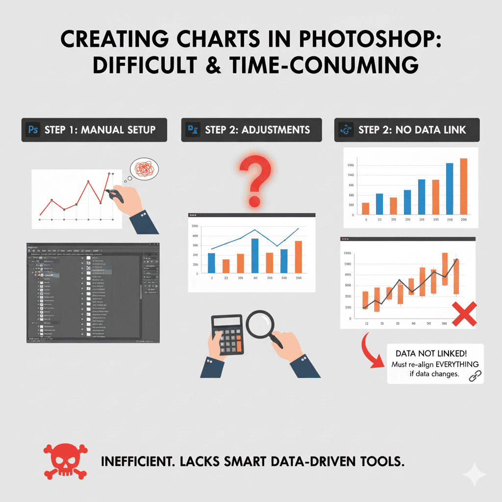
Powerful image editing software like Photoshop can also create beautiful charts. However, it has some very obvious drawbacks. First, you need to have design skills. Second, you need to be very familiar with how to operate this type of image editing software. If you're not a professional, this usually isn't a good choice. Charts created with this type of graphics software can only be exported as image files, meaning they're completely static. This means charts made in Photoshop and similar programs have zero interactive capabilities. If you want to share your results or embed them into your own website, you can only display them as static images. For complex charts like dashboards, stacked line charts, scatter plots, or radar charts, you'll need to spend a huge amount of time creating them. This clearly isn't what you want, because it wastes your valuable time.
Chart Maker can be widely applied in everyday life. Whether you're showcasing sales data and market trend analysis in business, presenting experimental data and statistical results in scientific research, or tracking learning progress and project milestones in daily life, Chart Maker has you covered.
Do you know why people prefer to present data using charts? Could this be related to the structure of the human brain? The following explanation will help you understand in detail why charts are used to present data and what benefits they bring.

Humans are naturally visual creatures. When it comes to the same set of data, presenting it in chart form is much easier to understand than just showing numbers. Research shows that the visual processing areas of the human brain take up about 30% of the cerebral cortex, while the regions responsible for understanding language and numbers only account for around 8%. This means our brains are much better at understanding and remembering information from images than from a pile of dry, boring numbers. Compared to raw numbers, charts make data more tangible and concrete. For example, a string of numbers like 1.2, 1.5, 2.1, 2.9... makes it hard to spot a growth trend at a glance. But if you plot these numbers as a line chart using Chart Generator, your brain can instantly recognize the "upward curve." Through visual features like shapes, colors, and angles, charts make it incredibly easy for the human brain to grasp the relationships between data points.

The human brain naturally has a higher level of understanding and acceptance when it comes to visual graphics. With the same dataset, if it's just dry, boring plain text, you not only can't intuitively judge data trends, but your brain also struggles to form solid memories of it. The result? After reading through the data, you're left with no clear impression, and most people will forget the details within an hour of looking at a spreadsheet.Since visual memory is superior to numerical memory in the human brain, when you display data using line charts, bar charts, pie charts, and other graphics, you can instantly spot trends, peaks, and changes across different data categories. A well-designed chart with vivid colors and clear structure often helps people remember the trends or key points. This is because graphics present data in a much more intuitive way.
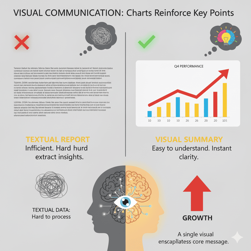
Charts reinforce key points through visual elements—for example, a red upward arrow conveys "growth" far more effectively than a paragraph of text. A well-crafted chart can often capture the core message of an entire report. For instance, a "2025 Growth Trend Chart" might be more compelling to decision-makers than a three-page analysis report. Charts reduce the "cost of explanation" and allow viewers to form their own conclusions. When audiences can actually "see" growth lines or gaps in comparison, it creates more trust than mere verbal statements. Charts are a "universal language" that transcends borders—trends, proportions, and differences can be understood without any translation needed.
Any changes to chart data or configuration take effect immediately. Your chart is redrawn in real time—no waiting, no extra clicks.
You don’t need to know any programming. Chart Generator is beginner-friendly—just configure and create charts instantly, even with zero experience.
Choose from a wide range of charts, including bar, line, pie, radar, gauge, and more. You can even combine different chart types into one visualization.
The homepage offers ready-to-use chart templates. Start from an example, tweak the data and style, and get your chart without configuring everything from scratch.
Save your chart and embed it anywhere with a simple Iframe code—perfect for websites, blogs, and dashboards.
Chart Generator provides extensive configuration options, so you can fully customize the look and feel of your charts to match any use case.
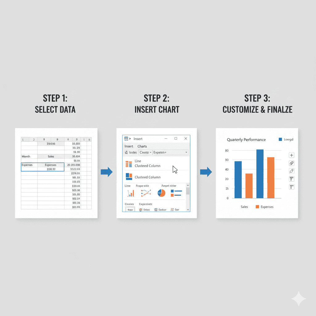
Creating charts with Chart Generator is very simple. First, prepare the data you want to use. Then, on the homepage, select the chart template you prefer and click the button to enter the chart editor. From there, you can customize the chart settings based on your needs.
The bar chart is the most basic chart we offer. Simply choose a template you like from the Bar Chart Maker examples, then click to enter the editor, and you can generate your own customized bar chart.
Yes. Chart Generator allows you to download your charts. On the chart editing page, the results of your edits are displayed in real time, and a download button is available above the chart. Simply click it to download a high-resolution image.
Yes. Chart Generator and Chart Maker are essentially the same tool, both designed for creating charts. So, when you see 'Chart Maker' elsewhere, it refers to Chart Generator, and vice versa. They are simply different names for the same tool, and you should consider them as one and the same.
Chart Generator offers a wide range of chart creation options. Currently, it supports pie charts, bar charts, line charts, polar charts, and Nightingale rose charts. Charts under development include radar charts, gauges, sunburst charts, and tree diagrams.
Yes, Chart Generator allows full customization of chart colors. You can customize the line color in line charts, category colors and background colors in bar charts, border colors of main charts, and the colors of individual sections in pie charts.
Graph maker is built on top of ECharts, a powerful data visualization library. It works by letting users configure charts through an intuitive visual interface, converting the input into ECharts configurations, and finally rendering the charts using ECharts.
Yes, absolutely. Any charts you create with Chart Generator are entirely yours, and you are free to share them anywhere.